Technology
Technology
Service
Service
Services
Branding
Workshop Facilitation
Research and insights
Digital design
Integrating excellence
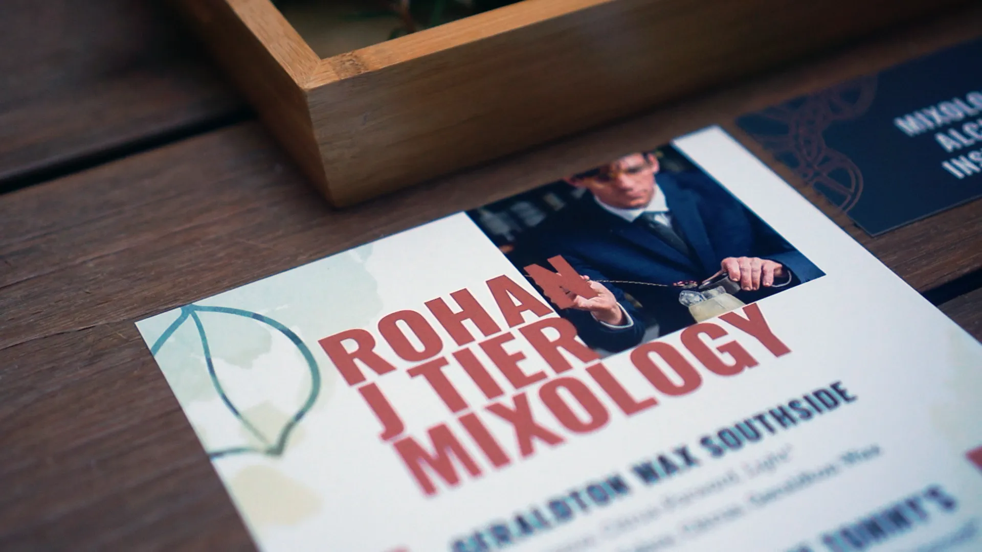
If you’ve ever been to Wildflower Restaurant in Perth, you've probably been served a cocktail crafted by Rohan. His passion for mixing Australian flora into his drinks has earned him a reputation amongst those who appreciate the art of mixology.
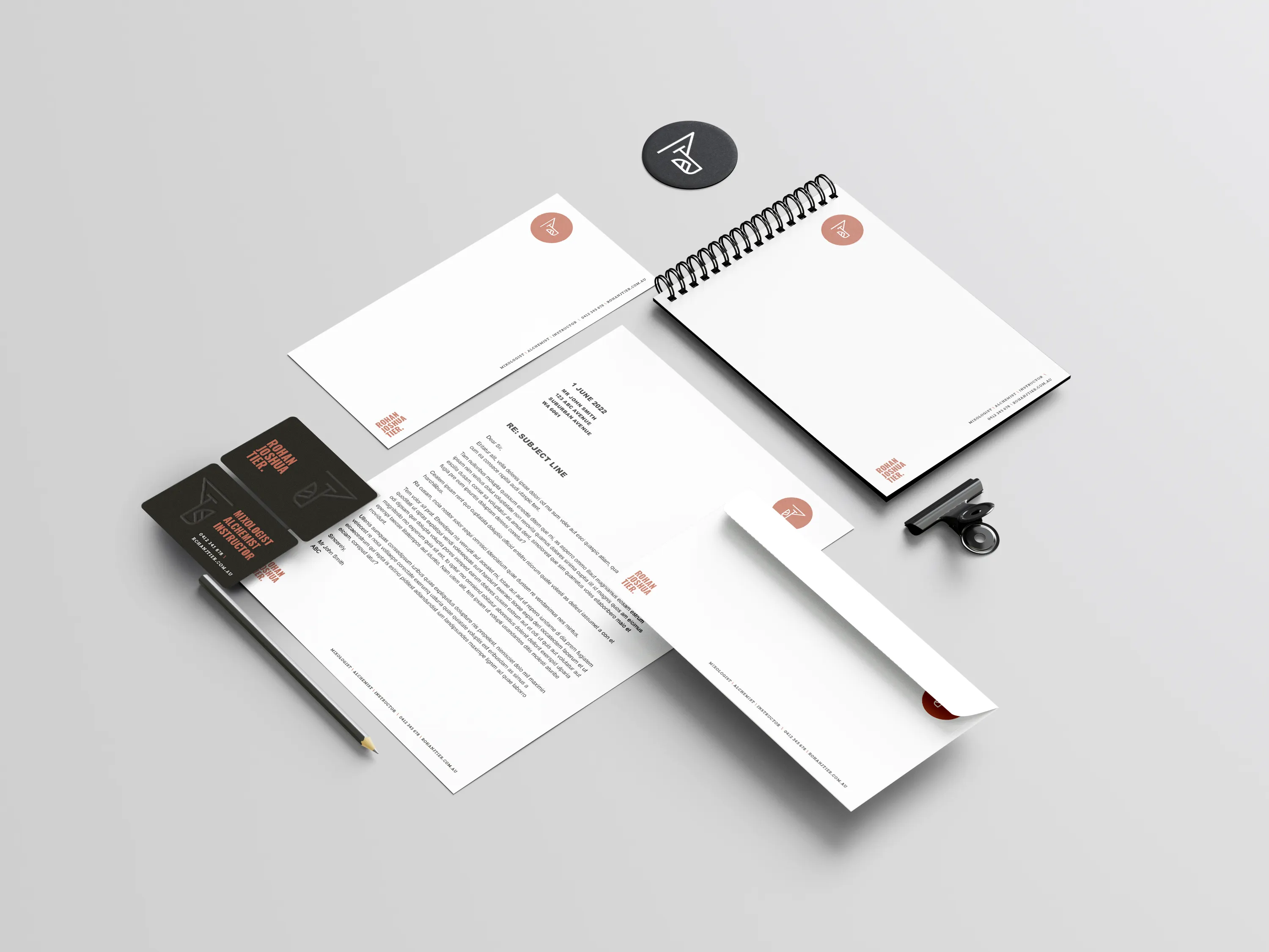
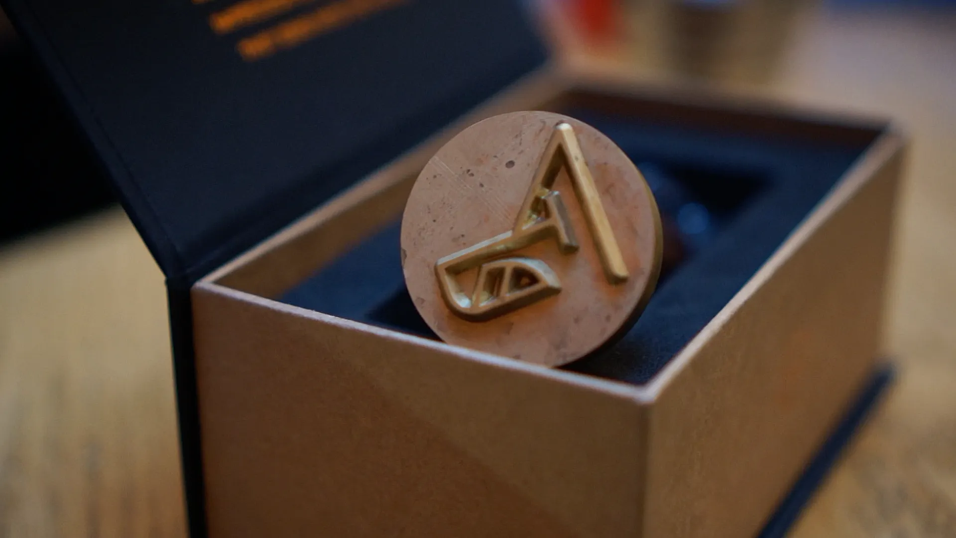
The creative team at Dapth met with Rohan to capture his passion and experience into a brand identity, that he could then use to deliver his unique experiences as a service. Deliverables included brand-new logo design, colour palette, typography, and other brand elements in line with Rohan’s desired direction for his consultancy.
“As one of the industry’s top private consultants, Rohan's brand vision had to be as crystal clear as a premium cocktail glass. Drawing inspiration from his love of native ingredients and passion for Australian flora and fauna, we infused these elements into his brand identity, creating a vision as distinctive as his expertly crafted cocktails.”
Bespoke innovation
Rohan was seeking an end-to-end brand identity refresh, with the aim of advancing his consultancy towards private events, venues, and stakeholders. As well as encapsulating his love for native ingredients, he also wanted to demonstrate his varied expertise and bespoke service offering within the WA hospitality industry. Other concepts Rohan was looking to convey included confidence, innovation, attention to detail, and Australian heritage.
The first step in this branding project was establishing Rohan’s vision and inspiration. It was clear that the brand focus needed to reflect his love of native ingredients, expertise, and bespoke service offering. After mapping out Rohan’s goals and requirements, we conducted research.
We gathered information and insights related to the design problem by researching the industry, market trends and competitor analysis.
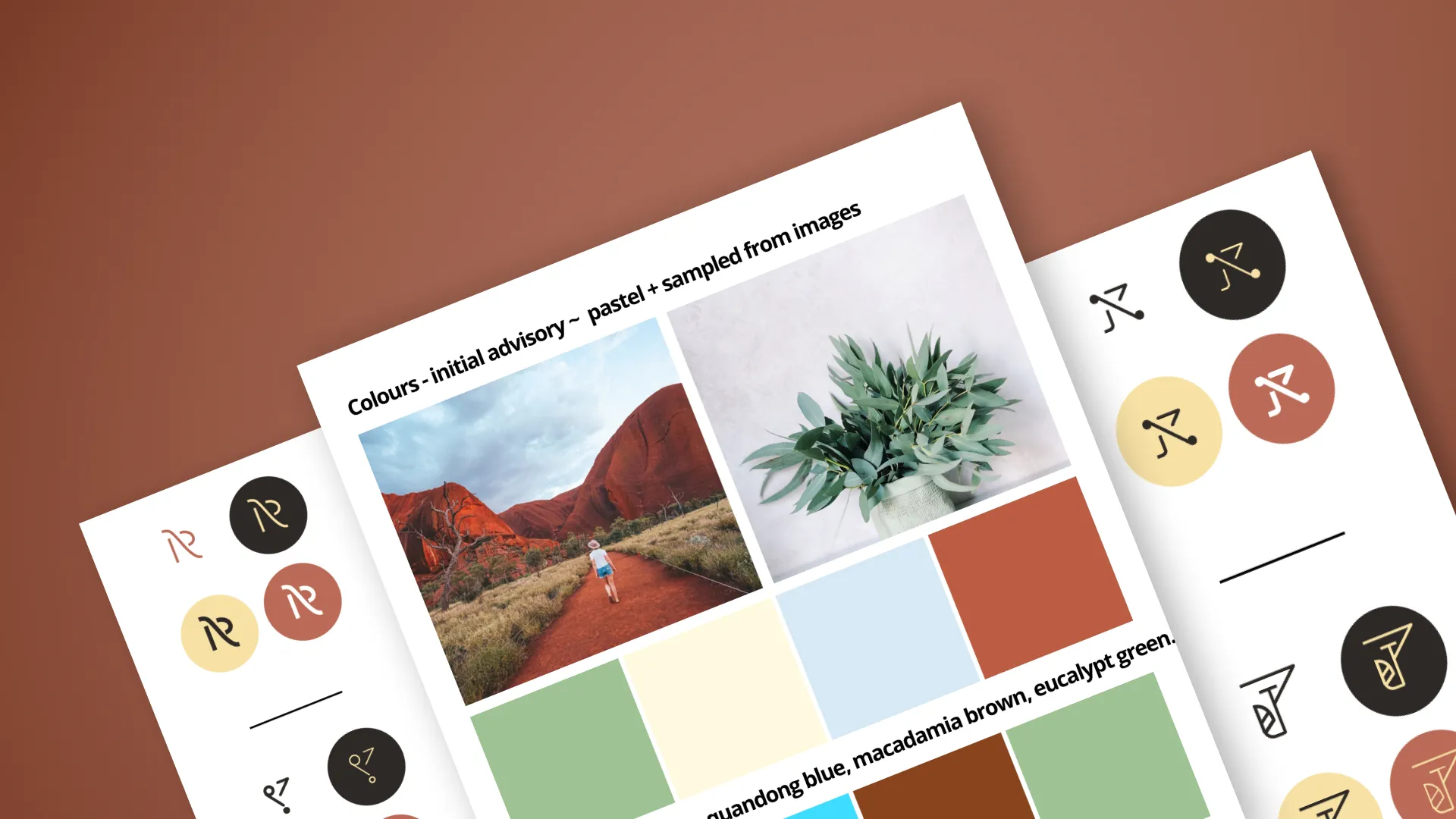
A comprehensive mood board was then created, essentially a visual representation of design direction and inspiration. The below mood board used shows images, colour palettes, typography, patterns, textures, and other design elements reflecting Rohan’s desired style and mood.
We then refined the design direction based on Rohan’s feedback on the mood boards. This was to ensure the stylistic approach was meeting Rohan’s requirements and objectives.
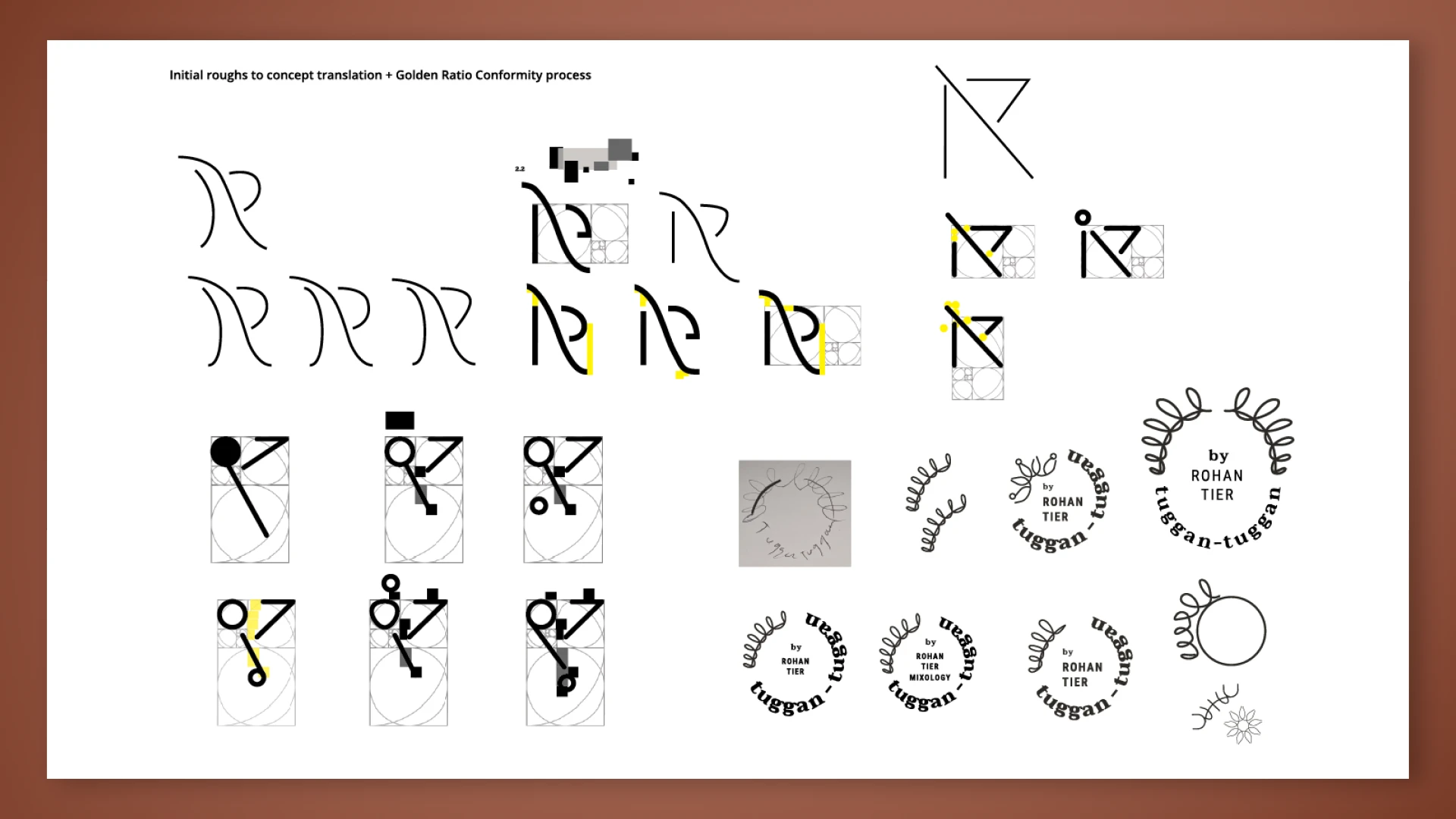
Once the direction of the design was established, we then developed design concepts that reflect the desired brand identity, based on Rohan’s directions. This included sketches and other visual presentations of the design:

Tailored expertise
The design concepts were presented to Rohan for feedback and approval. Based on the feedback, the design was refined and revised until the final design was approved.
To create a new logo for Rohan, we began with a typographic family font exploration. Exploring different possibilities within this font family, we then chose three possible names, as preliminary proposals for feedback.
The designs were developed in greater detail, and then digitised for approval. It was an exhaustive drawing process covering many possibilities, with various drafts exploring how the logo could potentially be composed.
Following research from the mood boarding process, we then gathered feedback from Rohan continually.
Based on both previous mood boarding and research, we developed a strategy for the logo that reflected the brand’s positioning. Multiple logo concepts were then created - essentially various drafts of sketches.
The initial concepts were then presented for feedback, following feedback, the refining of the chosen concept, and iterating until Rohan was happy to proceed.
Once the logo concept was finalised, we then explored colour options for the logo, considering the meaning of different colours, the colour psychology associated with the hospitality industry, as well as client preferences.
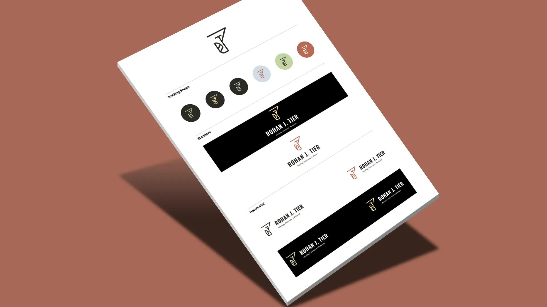
After the colour scheme is selected, we finalised the logo design, including any necessary adjustments to typography, spacing, and proportions. We then presented the final logo for client approval. As part of the shortlisting process, eight overall possibilities were presented and considered.
Rohan’s love for native ingredients was clear - so it made sense to feature the colours of his favourite cocktail ingredients within the branding.
Dapth considered which colours worked well for the industry and examined competitors. We also considered the meaning of different shades, the colour psychology associated with the hospitality industry. All this included Rohan’s continual input to determine his colour preferences.
We then mocked up a final colour palette for review. The colours used in the final palette were sharply focused on Rohan’s original aims of focusing on native flora and fauna. The final colour palette included myrtle green, quandong blue, macadamia brown, and eucalypt green - ingredients used in his drinks.