The brief

Yordee was searching for a rebranding to better reflect their commitment to youth empowerment and inclusivity in the healthcare and disability sector

As an independent organisation within the disability and healthcare sector, Yordee connects NDIS participants with independent providers locally, providing a hub of practitioners and resources. Yordee wished to convey how it faciliates this connection between participations and providers and how this benefits clients. As an enablement organisation, it was important that Yordee reflected this in their new brand identity. 


"We successfully delivered an end-to-end brand identity refresh for Yordee that was based on their core values."


Yordee approached Dapth for an end to end brand identity refresh - including brand discovery, colour palette, typography, logo design, branding  and web visualisations, as well as an audit of existing copywriting collateral.

The process

Translate the story through a completely unique brand, starting with a name

The discovery session kicked off the project, and involved a lead from both Yordee and Dapth to understand the app requirements, user features and functionality, as well as a roadmap of current and future business ideals and risks. Our team was tasked to understand the business model and services offered, then translate the story through a completely unique brand starting with a name. 


Researching and Mood Boarding

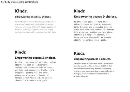
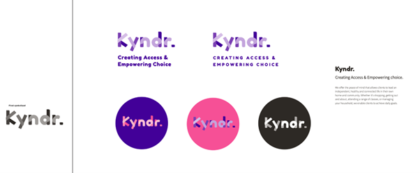
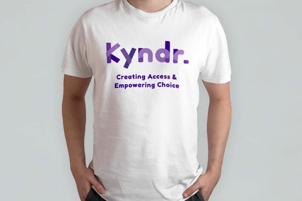
The mood boarding process included consideration of taglines such as empowering access and choices, general empowerment, empowering access in health, and accessibility. 

Other core values that were important to highlight included genuine support in reaching goals and allowing individuals the freedom to do what they want getting the most (value) through NDIS funding, and local support.  

One of the original statements captured was ‘We offer the peace of mind that allows clients to lead an independent, healthy and connected life in their own home and community. Whether it’s shopping, getting out and about, attending a range of classes, or managing your household, we enable clients to achieve daily goals.’  

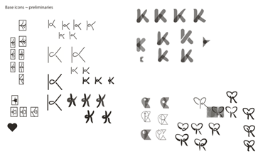
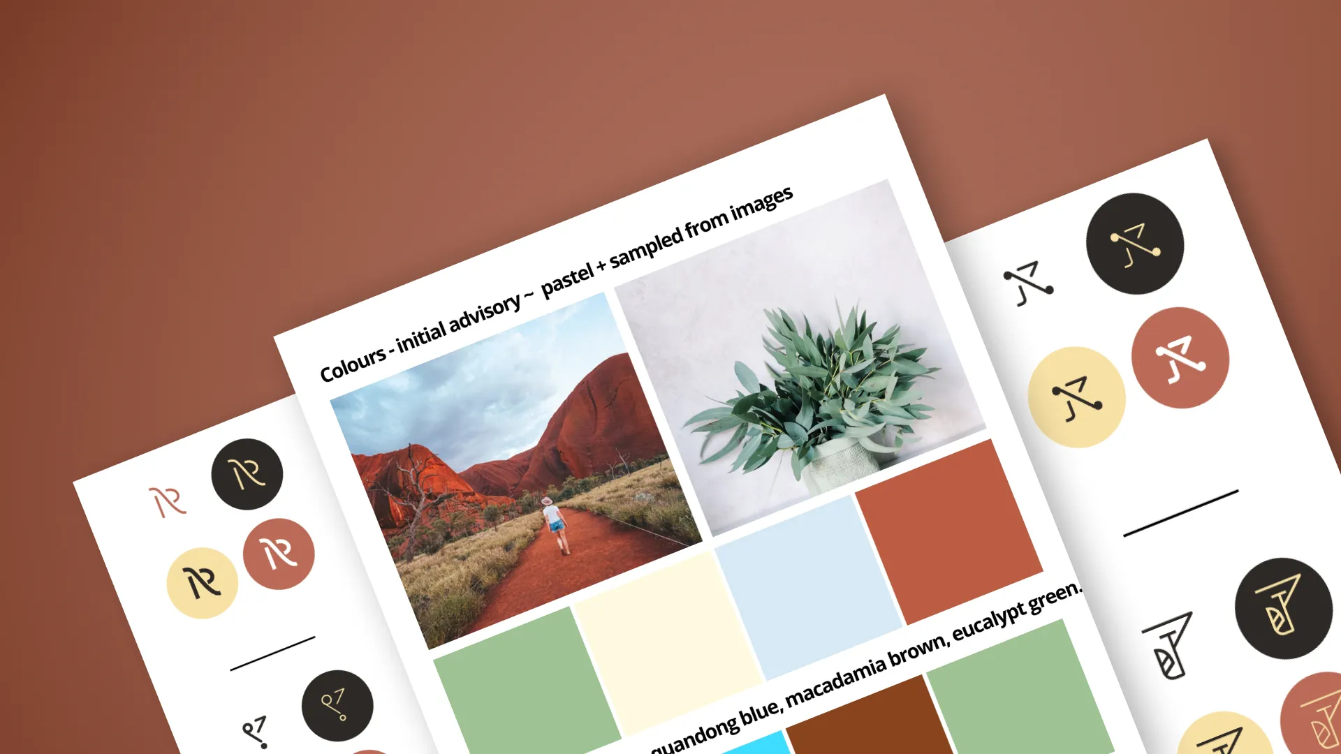
Research into demographic, photographic styling, potential colour palettes and scheming, as well as typography, was then undertaken.

The branding process


Typography breakdowns including:

  • Uppercase / lowercase delineations, brainstorming across the specified typography as proposed during the researching & mood boarding process was undertaken, as seen below. 
  • Typography paired with brainstorming then followed. 

Digitisation stage for icon design

We went through manually translating sketches into digital forms with the Golden Ratio.  With no more than four overall options, we then proceeded to combine these into typographic arrangements.

Preliminary guided decision


Upon submitting an array of coloured options to the client, we also pre-emptively made a recommendation on one of the four shortlisted options. These also include mocking up the logo in various mediums.

Project Outcome

Dapth successfully delivered a full brand identity refresh for Yordee

As time elapsed, the client wanted different naming altogether – “Yordee”; following from the above style preference. With the same branding / logo type treatment was then applied onto “Yordee”.

However, “Creating Access & Empowering Access” was also later changed to “Your Decision. Your Way,” as the themes Yordee wanted to focus on included empowerment, independence, and accessibility. They also wanted to reflect caring and genuine support in helping individuals reach their goals as well as localised support. 

The rebranding reflects Yordee's commitment to empowerment, inclusivity, and accessibility, and includes a new logo design, colour palette, and website development.

We transform

Transforming organisations across WA